Convoluted
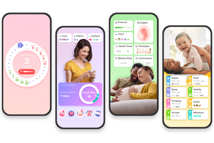
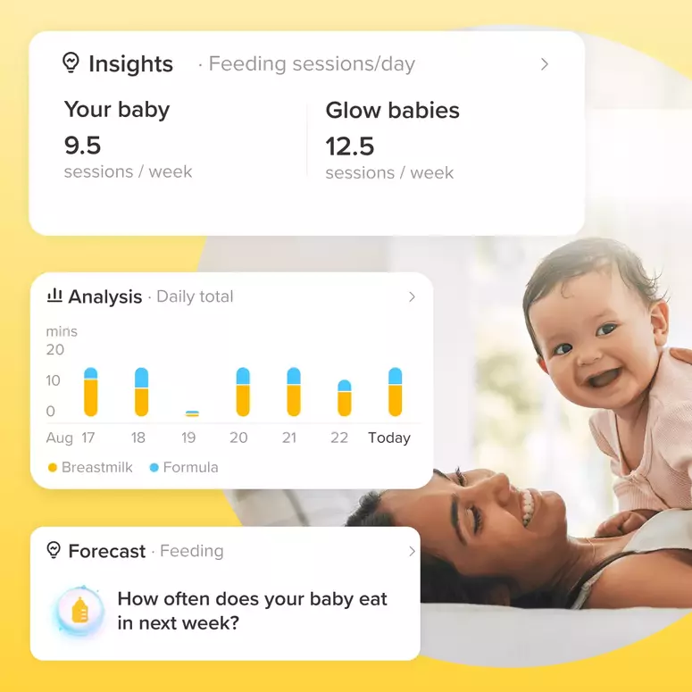
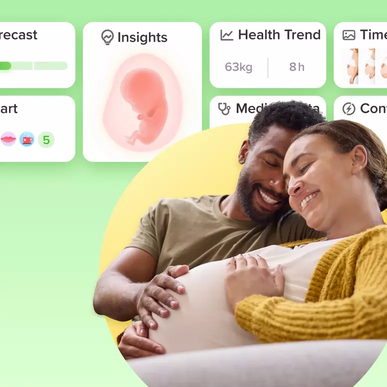
This app is so Busy, with the information scattered and sliced to present it in different ways, but you get to it from different places and it's hard to remember where to go.
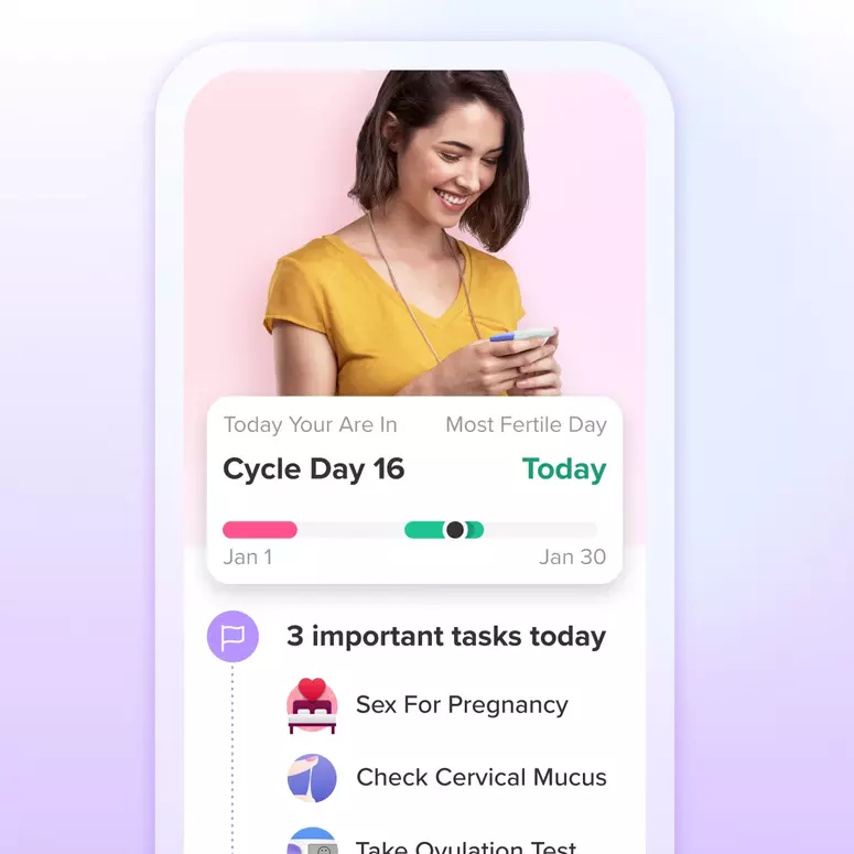
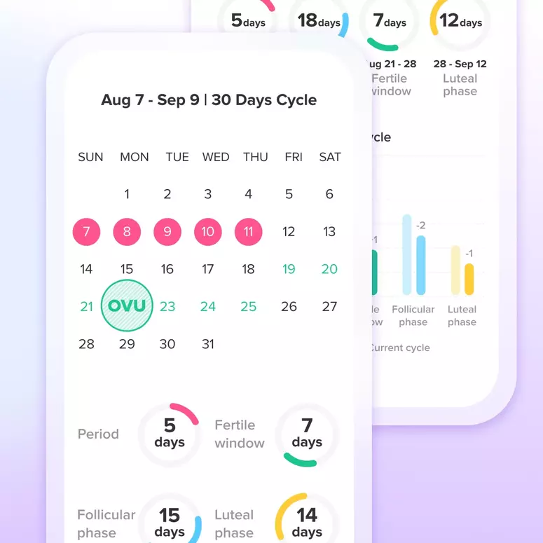
As an example, Glow predicted my period to go 28 days, I guess because I'm a new user and it didn't believe the past 6 months of periods I entered with an average length of 25 days. So when I started as I expected on day 25/26, I tried to log the flow. But the menstrual flow log wasn't there, only the spotting log. I had to go onto the calendar and edit so the period started on the day, and then go back to the daily log. Now it shows menstrual flow to log. I don't understand why that can't all be in one place.
I wouldn't want to see less information, I just don't like how convoluted it is to do something as simple as log my period when it starts "early".
I'm also pretty sick of the slot machine thing. If I paid for premium, it's 1000% so I don't have advertisements blinking at me.
Let's Glow!
Achieve your health goals from period to parenting.
