polls and charts
This is nerdy, but using a bar graph for polls on his app is inappropriate in terms of chart use. Answers are measured as percentages, not a tally. So a pie chart makes more sense than a bar graph.
It's just an app "for fun", but this does actually bother me 🤓.
Add Comment
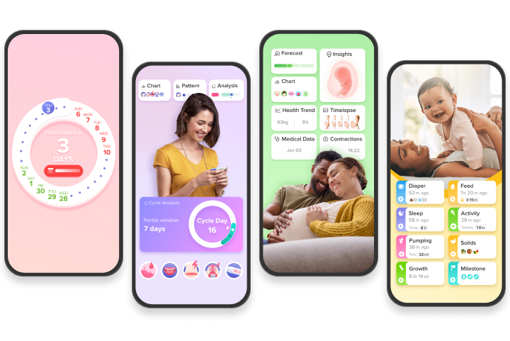
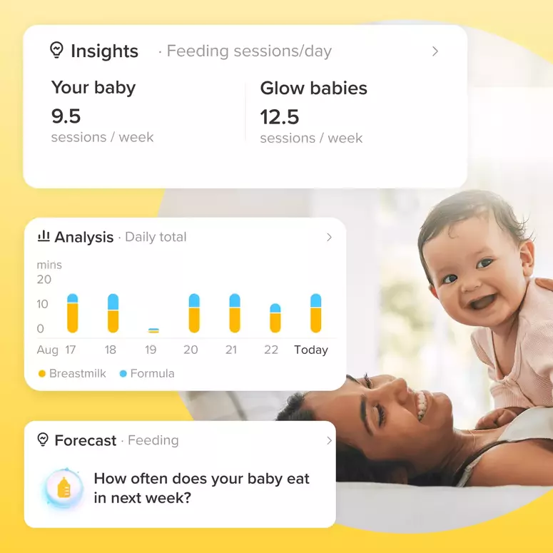
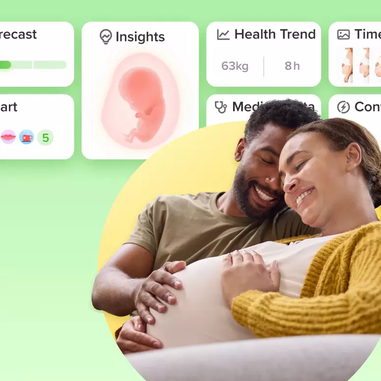
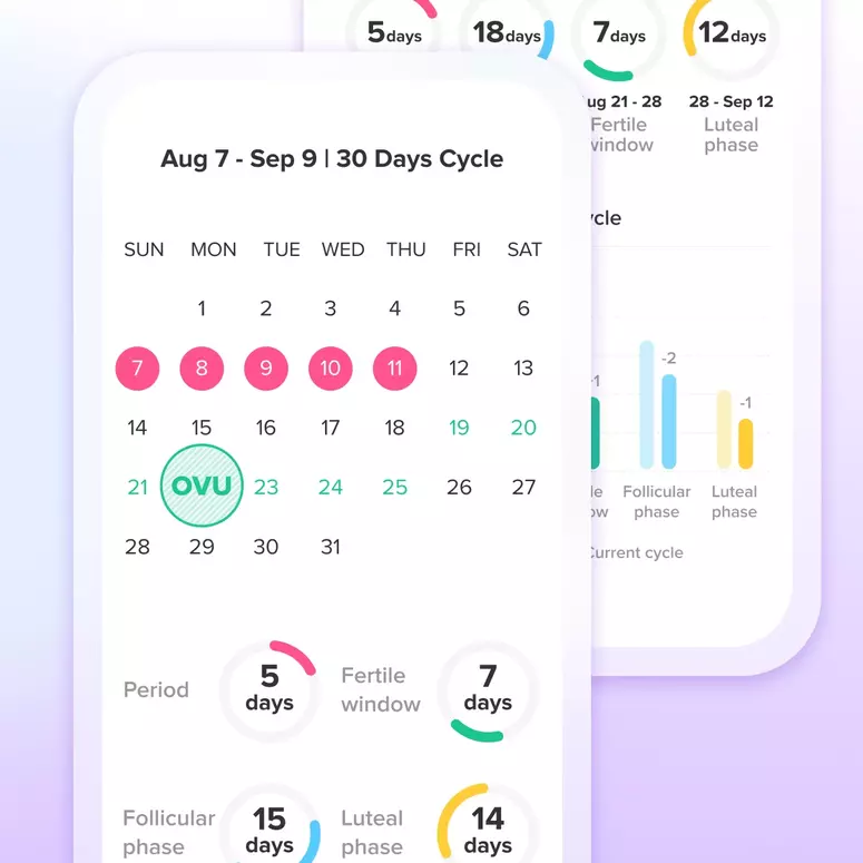
Let's Glow!
Achieve your health goals from period to parenting.