1.
2.
3.
4.
Vote below to see results!
Se
gi
JO
ʏ
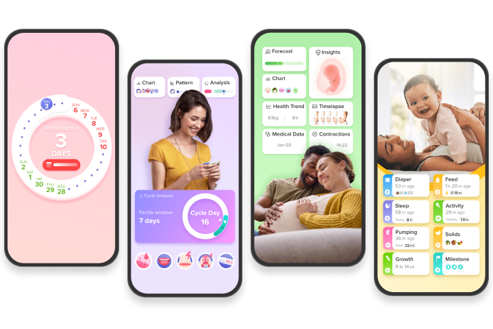
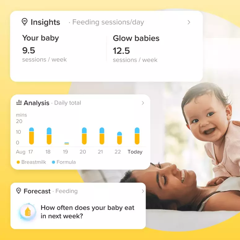
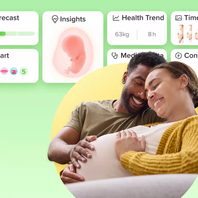
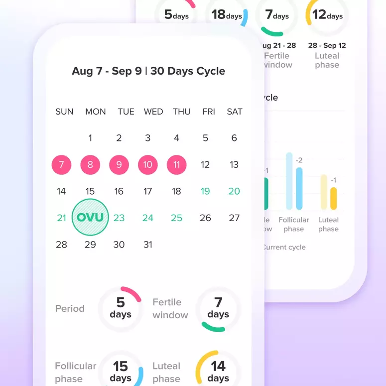
Achieve your health goals from period to parenting.