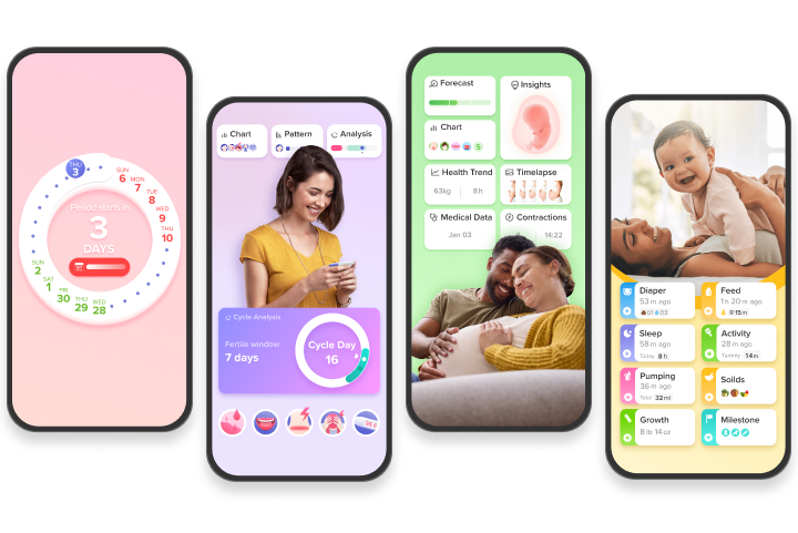
Eve’s interface is too busy!
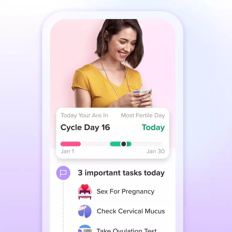
Am I the only one who struggles to find basic things? I was looking to be sure what phase I’m in (I’ve been crying a lot more than usual) and I had to maneuver and scroll a lot just to get this info.
The app’s interface looks and feels busier than it used to be and makes navigation cumbersome for the user. If anyone has any hacks for navigating hormonal phases etc, will appreciate it!
Add Comment
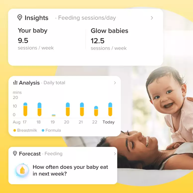
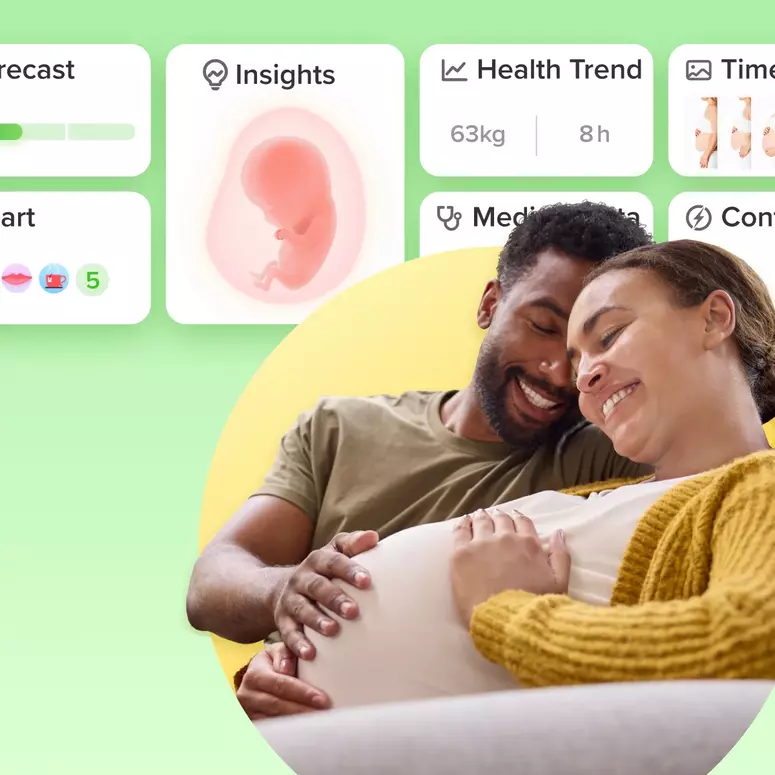
Let's Glow!
Achieve your health goals from period to parenting.